Centralized wealth management in one app
Fynce was a web application designed to help users visualize and manage their entire wealth portfolio in one place, from cash and investments to real estate, debts, and other assets. Later on, the platform evolved to offer automated investment services, allowing users to delegate portfolio management directly to Fynce in exchange for a fee.
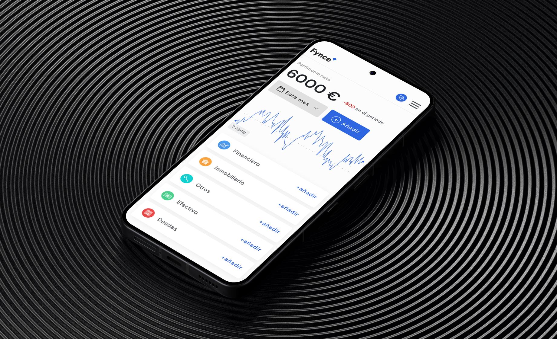
Challenge
When I joined the team, Fynce had a small set of existing screens and a basic landing page. However, both the founders and I agreed that the product needed a complete visual redesign, a more refined experience, and the addition of key features to be ready for launch.
The challenge was to redesign and expand the application in under a month in order to go to market with a more cohesive and user-ready solution.
I came into the project at an advanced stage of the design timeline, with an implementation date already set and a target user profile already defined by the founding team. This left little room for proper user research before redesigning, which contributed to some of the strategic challenges that followed.
My role
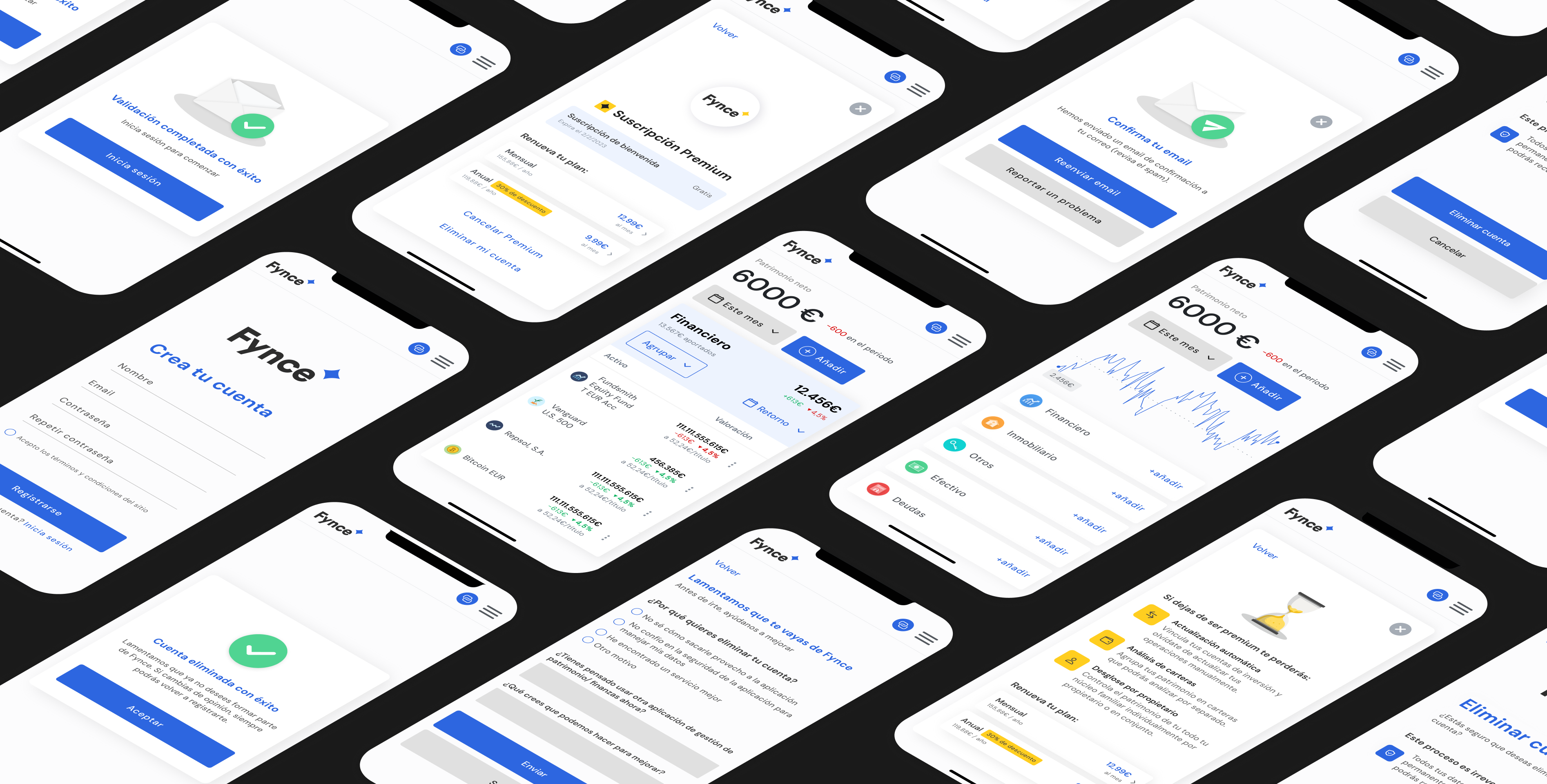
I was fully responsible for the UX/UI design of the product, redesigning the interface, proposing new flows, adding key features, and designing essential screens such as the dashboard, account system, subscription system, and onboarding.
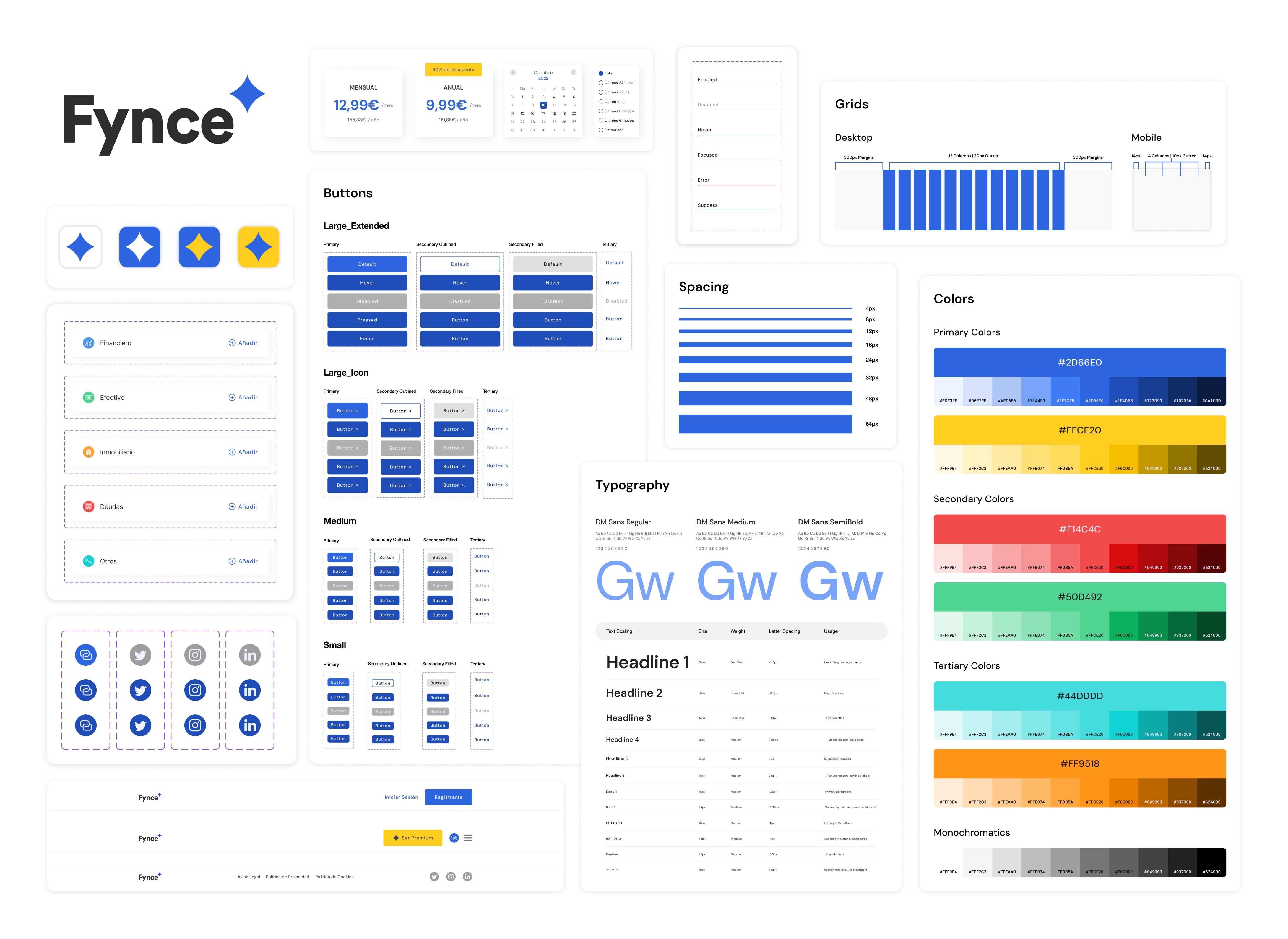
I created the full design system from scratch, including colors, typography, components, and iconography, and applied it consistently across the app and social media.
I also supported the front-end implementation (HTML, CSS) of the screens I designed, and produced visual content for launch campaigns, including banners, posts, and educational mini-infographics.
LEAN UX
Design Process
01. Audit & Research
- Conducted a full audit of the existing version: analyzed the product's architecture, user flows, and interface inconsistencies.
- Identified UX friction points and opportunities for simplification.
02. Product Definition
- Collaborated on defining the product structure across all core sections: investment dashboard, user profile, subscription tiers, and account linking (manual and automatic).
- Re-structured user flows to improve task clarity and reduce friction.
- Aligned visual and functional decisions with the product's strategic goals.
03. Visual Design
- Built a complete design system from scratch: colors, typography, iconography, components, and states.
- Executed a full UI redesign focused on visual clarity, accessibility, and layout hierarchy.
- Designed responsive screens for all key product areas.
- Developed a one-page marketing website to support initial launch.
- Created branded visual content for social media aligned with product tone.
04. Implementation & Iteration
- Provided front-end support with HTML and CSS to guide screen implementation.
- Used Hotjar session recordings and behavior analytics to understand friction points.
- Collected early-stage user feedback through targeted usability questions.
- Iterated on visual tone and layout details based on engagement data.
- Delivered design documentation and guidelines for consistency across future updates.
Outcomes & reflections
Fynce was launched just one month after I joined the team, with a 30-day free trial offered to early users. Based on initial feedback, I redesigned part of the visual system, which contributed to a lower bounce rate and higher conversion from the landing page.
Although the app gained real users and was launched publicly, it faced strategic challenges around market positioning. During the process, I proposed shifting the focus toward younger users (people in the early stages of building wealth) as this aligned more naturally with the brand's educational content and the product's long-term retention potential. However, the founding team had a strong preference for targeting high-net-worth individuals, a profile that often prefers more established platforms and doesn't typically engage with educational or startup-oriented messaging.
This misalignment was also reflected in public reactions to marketing campaigns, where many users expressed disconnect or skepticism in comments. Additionally, the predefined user profile limited the opportunity to conduct deeper research early on. I joined during an already compressed design phase with little room for validating assumptions or exploring real user needs before implementation.
This project allowed me to apply strategic design, contribute to product thinking, and execute end-to-end, while also sharpening my critical eye for what makes a digital product truly viable in the real world.